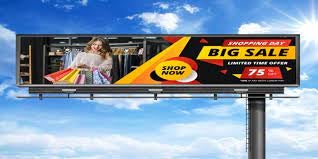
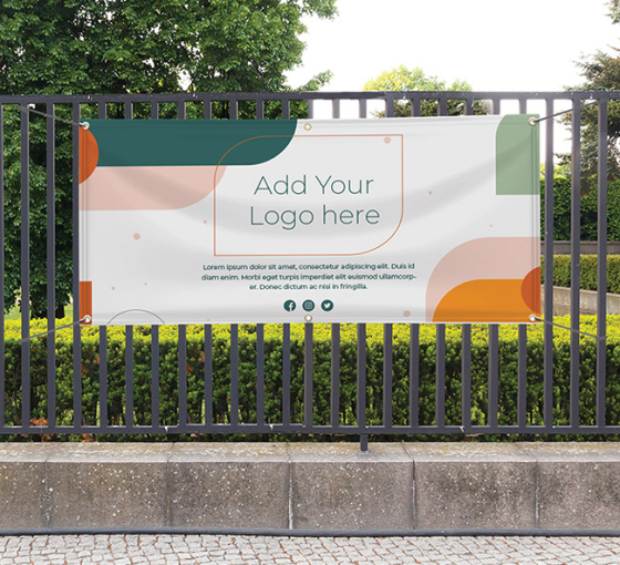
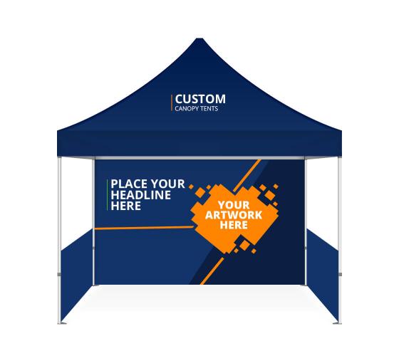
In the blink of an eye, 2021 is almost over, and the holiday season is upon us. When you have hoards of shoppers flocking to your store, you only have a couple of seconds to make a solid impression and attract their business before the competition does. Here’s where indoor and outdoor banners come to play. However, when the stakes are as high as they are during the holidays, simple banners just won’t cut it. Investing in custom banners will ring in the holiday season and earn you an impressive ROI year after year.
That being said, designing your holiday banners is not a simple task. It’s walking the fine line between tacky and overdone to underwhelming and ineffective. To avoid such a scenario, we have rounded up a few tips on how to achieve your best holiday banner designs.
Keep Your Banners “On-Brand”
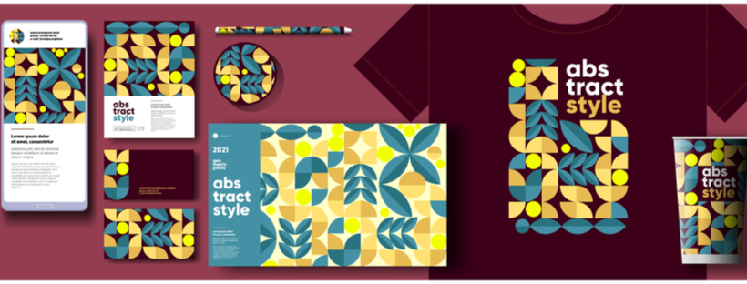
Consistency is key to branding. As such, all of your marketing materials, be it indoor and outdoor banners, product displays or online blogs and social media posts, should reflect the same brand voice and aesthetic.
The quickest way to ensure this alignment is by setting a broader marketing goal. First, identify your company’s mission or purpose and your marketing goals before you start designing. Then, discover ways you can link the various channels and their contributions to this goal. Finally, focus on the roles of holiday banners in the larger scheme of things.
This top-down approach will help you create a centralized marketing repository that acts as the baseline for all materials and their respective designs. After curating such a library, you will find it a lot easier to keep your banners consistent with your brand. So, whether you design banners, table covers, or pop-up displays, everything will carry the same message.
Less is More

Holiday banners and signs are often the greatest victims of cluttering. Stores try to cram in the holiday message, wishes, and offers all in one place and it leads to a hard-to-read, ineffective use of a powerful marketing tool.
Less truly is more when it comes to an effective marketing approach. For your banner messaging, follow the KISS principles: Keep It Simple, Silly. To make sure that you leave nothing out, here is a quick list of key information to include:
- Typical holiday message or greeting
- Festive imagery and symbols
- Colors of the season
- Brand name
- Border
Of course, the above list is purely subjective, and you’ll have to make minor modifications to meet your marketing requirements. For instance, an indoor banner would focus largely on the ongoing offers and promos. On the other hand, outdoor banners would be used to try and attract customers towards the store.
Format for Custom Prints
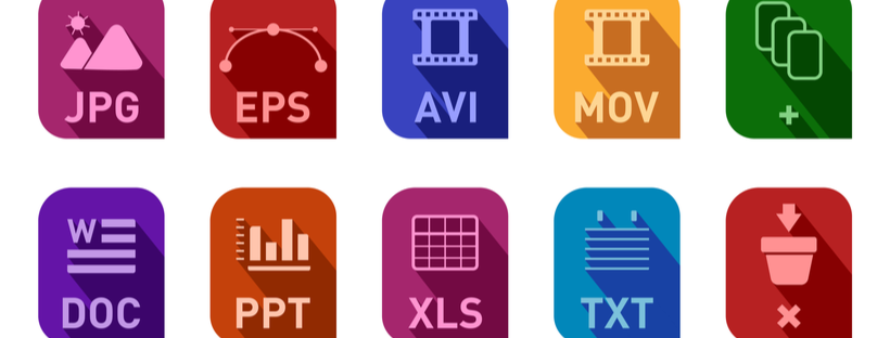
If you plan to print high-quality graphics on vinyl banners, you will have to share the right print files that can support it. Select high-quality design elements in the largest file size possible. Practice caution while resizing graphic elements so that it does not discolor, pixelate, or distort in the final print. The best way to dodge potential issues is by using vector files that deliver the best results.
And once you are done designing, stick to standard print file formats, such as:
- PDF for most files
- EPS for large banners and signs
- JPG for images
- TIFF for higher resolution
- GIF/PNG for color reproduction
ZIP the files while transferring them for premium data sharing.
Readability is Key

After all the time and effort you would put into designing the holiday banner, it would be a shame if your audience is unable to read it in the first place. To avoid such an unfortunate scenario, here are some design best practices that will come in handy this holiday season:
- Use a blend of high contrast colors to increase visibility.
- Stick to standard fonts that are clear and legible.
- Choose a font size and scale that is appropriate for your banner.
- Follow the 3 by 5 rule – three lines of text having five words per line or five lines of text having three words per line.
- Consider double-sided exposure, if your banner is visible, in order to move traffic in either direction.
Such considerations will ensure that your indoor and outdoor banners are readable at all times.
Factor in the Placement
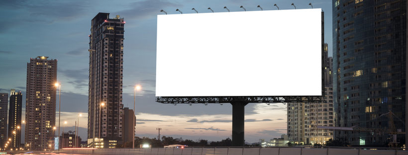
Outdoor banners are not designed in the same manner as their indoor counterparts, and vice versa. Apart from this highly intuitive design understanding, you will also have to consider the placement of your holiday banners to offer greater visibility.
Think about the backdrop for the banner placement, would these be placed against a brick wall or a wired fence or a pop-up display? How would such a background impact the visibility of your banner? At the same time, measure the area where you intend to install the banner. You would not want a holiday banner that is oversized or too small for the space set aside for it. Factor in any installation accessories that you would require as well as the corresponding margins.
Follow these banner design steps to create well-branded, vibrant banners for your holiday advertising initiatives.


 Posted in