It takes five to seven impressions to generate brand awareness for your customers. While banners are a great way to boost your brand’s touchpoints and rise above the competition, there are some factors to consider when designing signage that converts. Make sure none of those incredibly important impressions are marred by blurry images or missing text. Keep in mind as you design your print signage strategy that by checking every little detail, you’ll be well on your way to an overnight design success.
A Well Designed Difference
According to research conducted by Adobe, design-driven companies secure a 1.5 times greater market share over companies who do not prioritize creative brand strategy. In fact, a report by the Design Management Institute found that companies with design-centric marketing strategies outperformed the S&P Index by 228%.
As you embark on your banner design journey, your small business can generate big returns with simple design tweaks like proper file formatting and commissioning a project-based graphic designer.
Correct Specs For Design Success
It only takes 90 seconds upon initial viewing for someone to make a subconscious judgement about your products or services. Pixelated images or poorly formatted text on your signage could seriously hurt your sales potential. On the flip side, well-executed design for printed signage can boost your business.
Knowing how to properly format your digital asset files is paramount to flawless banner printing. However, not everyone is a seasoned graphic designer. These specification suggestions will ensure proper printing of your text and images and ensure your signage investment reaches its full potential.
Choosing The Correct File Format
Half of all in-store shoppers cite on-premise signage as the motivator for their visit. Well designed signage will generate new business opportunities for your company and changing the design of signage can boost sales by 10%. Simple file formatting changes will ensure a higher return on investment for your signage and help you see similar results.
When you design your banners, raster images and vector images are the two main graphic file types you will use. File format and file size works differently for each of these options. All logo designs should be vectorized. While image-specific digital assets will typically be rasterized.
When To Use Vector Graphics
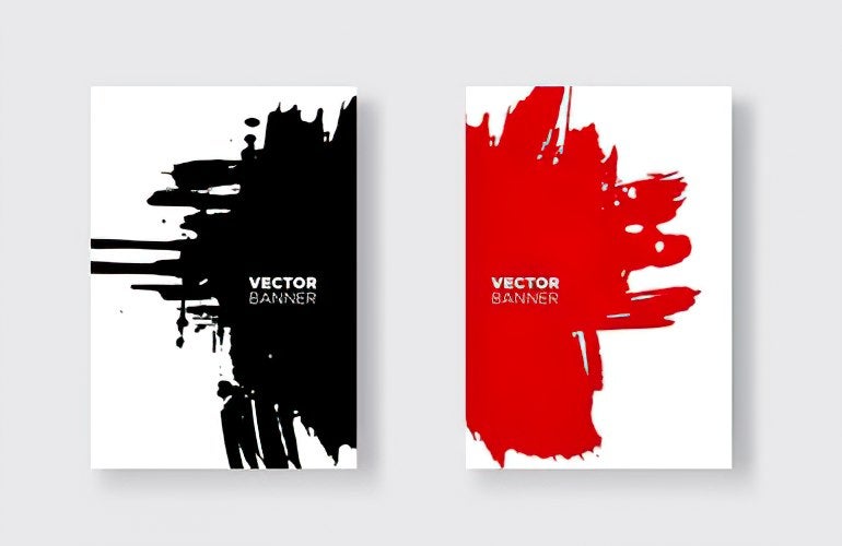
Vector graphics use geometric principles like lines, curves, and shapes that are scalable to any size, which is why they are a great option for print signage. You can scale vector files to fit a brochure or a large banner. Since these images are based on a mathematical equation to scale them to different sizes, your images will remain crisp and clear regardless of which banner you purchase.
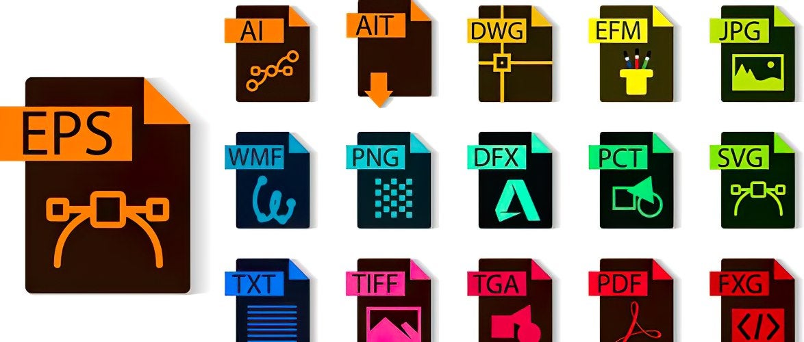
When you submit vectorized graphics for print reproduction, make sure you convert all fonts to outlines, also referred to as “curves”. The following file types are acceptable for vectorized graphics and ensure the highest quality banner prints: .EPS (Encapsulated Post Script), .Ai (Adobe Illustrator), .PDF (Adobe PDF). Adobe Illustrator is a fantastic graphic design software option for developing and formatting your vectorized logos and other digital assets.
When Is The Right Time To Use Raster Images
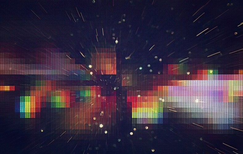
Raster graphics use a pixel-based, dot matrix structure. So, when you try to enlarge these images, they may become blurry if the image is not high resolution. Raster graphics are your go-to for picture-based printing. For example, if you wanted to print a menu brochure or a banner with images of your lunch time menu options, you would likely opt for rasterized images.
However, this graphic type can be tricky for print reproduction. Thumbnail and web images typically are not high enough resolution to be used for large scale banner printing.
Print best practices for raster images require the correct dpi, or “dots per inch” file ratio. When using raster graphics, save and submit files in the following formats: .PSD (Adobe Photoshop), .JPG (High Resolution JPEG), or .TIFF (High Resolution .tiff). Use these file format ratios as a guide for scaling high resolution images:
-100% scale (full size output) at 100 dpi.
-50% scale at 200 dpi.
-25% scale at 300 dpi.
-10% scale at 600-1200 dpi.
In regards to raster graphic CMYK four color process printing, 150-300 pixels per inch is ideal. Another print consideration for your signs is when to use a bleed. A bleed is the amount of information that extends beyond the final size of a printed product.
This technique allows you to print your piece slightly oversized so you can cut it down to seamlessly fit to your other pieces. There are very few products for which you would use a bleed, though certain banner stands may require one. Carefully review product details before purchasing to see if this option is right for your needs.
Tips And Tricks For a Successful “Hire A Designer” Experience
Maybe overnight graphic design mastery isn’t in the cards for you. Don’t worry, a quality Hire A Designer program will help. Proper file formatting is the foundation of a successfully printed banner but, if you need a bit more help, designers are standing by to help you achieve your banner goals.
Once you find a print marketing product that you like, such as a banner or window decal, use the available downloadable templates to upload your graphic files. Keep in mind that templates change according to the size of the product you order, so the sizing considerations listed above will set you up for successful file submissions.
Be sure to set the canvas size in proportion to your banner size so the images are accurately aligned when they are reproduced. Keep a two inch margin to prevent images and text being cut off by hemlines or eyelets and make sure you convert all text to outlines so your message is easy to read. Lastly, when you upload a graphic project file, make sure all files are embedded in the cavas. Alternatively, you have the option to upload each file separately if you prefer.
Original graphics are the highest-performing visual content in the marketer’s arsenal. Make sure you maximize your banner’s ability to drive traffic and increase sales by properly formatting your design elements. If you get stuck along the way, don’t worry. A Hire a Designer program will help straighten out any issues that may arise.
References
10 Reasons Why Personal Branding is a Requirement for Marketers & Business Leaders
Pam Moore
Adobe Digital Economy Index: UK online spending surges to £28 billion in the first three months of 2021
Adobe
Trademark Protection Of Color Alone:How And When Does A Color Develop SecondaryMeaning And Why Color Marks Can Never BeInherently Distinctive
Diane E. Moir
https://www.tourolaw.edu/lawreview/uploads/pdfs/27_2/9.pdf
The DMI Design Value Index
DMI
The Economic Value of On-Premise Signage
Signage Foundation, Inc.
14 Visual Content Marketing Statistics to Know for 2020 [Infographic]
Venngage
2016 Benchmarks, Budgets, and Trends—North America
Content Marketing Institute
https://contentmarketinginstitute.com/wp-content/uploads/2015/09/2016_B2B_Report_Final.pdf


 Posted in