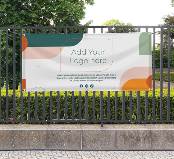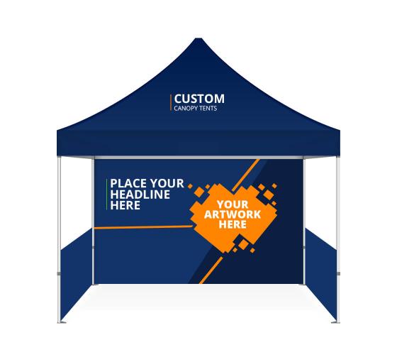
Outdoor advertising is a mass-market platform used to promote a product or service to consumers when they are outside their homes. The most popular spots for such advertising usually include billboards, taxis, telephone booths, park benches and more.
Previously, outdoors ads were merely used by businesses to raise brand awareness. However, with the advent of QR codes and simple web addresses, they have slowly transitioned towards starting a conversation with potential customers.
Since outdoor ads enjoy better visibility since you can pick a vantage point of your choosing design is of the essence.
However, most businesses don’t want to spend a lot of time designing a new banner, poster or signage with every season or every time they launch a new product or offer.
Keeping that in mind, here are six tips to keep in mind when a business like yours is trying to zero-in on design and content for outdoor ads:

It is tough for consumers to read long sentences or paragraphs on a billboard ad. And while they are passing by, they won’t have longer than a couple of seconds to read and comprehend your content.
Therefore, make sure your ad copy is not more than 10-words long. Your messaging should be precise and to-the-point. Don’t clutter the display with multiple graphics or complex messages. Stick to one idea and amplify it!
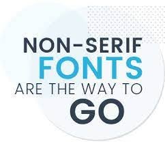
Technically speaking, thin lines would optically break up or fade at 500 feet. Italics and decorative fonts are often difficult to read.
Therefore, it is best to use upper and lowercase sans serif fonts in the copy. Moreover, make sure the letters are at least one foot long and thick for easier comprehension.
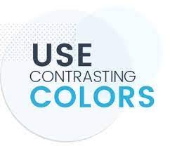
Bright and saturated colors work better for outdoor ads as they improve the overall readability of the content. Choose the right color combinations to evoke specific emotions within the consumers.
For instance, red and green are not legible together, but green and white make a great combination. Take a look at the chart given below. Which palette do you think ensures greater visibility? It’s important to keep in mind that don’t use subtle colors in your ad. Subtle doesn’t work at 500 feet!

Whether it an outdoor banner, signage or poster – don’t hesitate to leave a little unused space in the advertisement. Certainly images and fonts are imperative to communicate but too many elements or large fonts can feel overwhelming to the prospective customers. Use of white space is key here — use it strategically in order to enhance amplify the important information.

Consumers identify with advertisements that show a product or service. Therefore, use compelling graphics or photos to enhance the recall value.
If your ad design is text-based, experiment with the font size, color combinations, and style. And the cardinal rule is Show, don’t tell.

Avoid depicting numerous images or a complex message that is difficult to fathom by the consumers. To emphasize our previous comment, pick one key message and amplify it.
You want your prospects to not miss out on the main message and not get lost in too many elements. Simplify your ad for a bigger impact.
Wrapping up
An effective outdoor ad stays in the minds of the consumers long after they have driven or walked by it. So make sure it is designed well.
Eager to try outdoor advertising to boost your business growth? BannerBuzz can help you get started. Call us on 800-580-4489 or visit www.bannerbuzz.ca/ for more details.


 Posted in

