What differentiates brands from their competitors? The product is one thing that works to set brands apart from one another, but the biggest differentiators are branding and marketing design.
Branding
This has become an all encompassing term, because branding is present in all your marketing efforts, but it branches out into other areas as well. Think of your favorite brands. Obviously the quality of the products themselves is important, but what really makes a difference when making a purchase is the feeling a brand produces.
Branding is the summation of your hard work and comes down to two different areas that come together in harmony to produce a marketer’s dream: visual identity and brand voice. Each is equally important and both need to be in a symbiotic relationship.
Visual Identity
What is the special sauce that makes McDonald’s Arches so iconic? According to a study by University of Loyola in Maryland, color increases brand recognition by 80%. The bright bold color and font choice for McDonald’s are two of the most popular designs on planet earth. The fact that it’s bright presence can be seen in every town across the world is an extension of their branding efforts.
Color Schemes
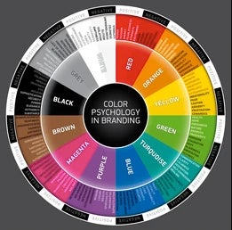
Compared to the other senses, sight seems to have the edge when it comes to decision time. The color you choose in your branding can quite literally make or break your business.
Color serves as a differentiator from your competition and also an extension of your brand identity. According to research by the Secretariat at the Seoul International Color Expo, 92.6% of consumers say that a strong visual identity is the most important factor when making a purchase. Nothing is more important in that visual identity than color. In fact, 85% of buyers claim that color is a primary reason when they make a purchase.
A Study In Green
Heinz once changed their famous red ketchup to a green color, it originally led to a 23 million increase in sales. Green is a dominant color that makes you think of growth. Its variety of shades express renewal and life, feelings of abundance, and it’s associated with refreshment and peace, rest and security. In a sea of red colored bottles, a green colored bottle would clearly be a differentiator.
It’s Not Black and White
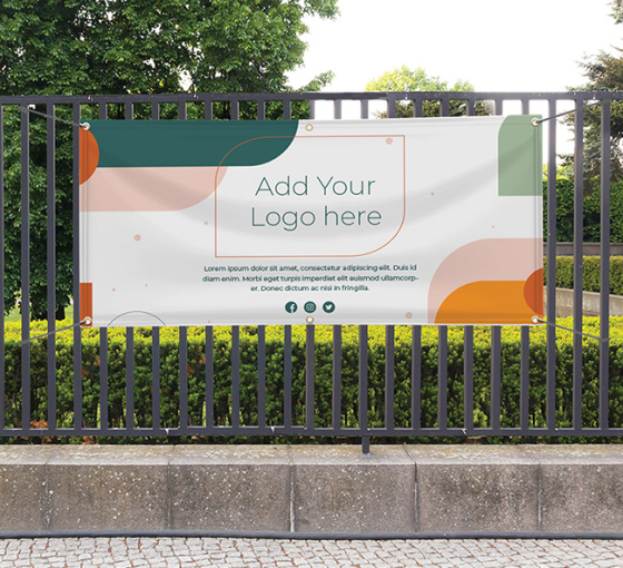
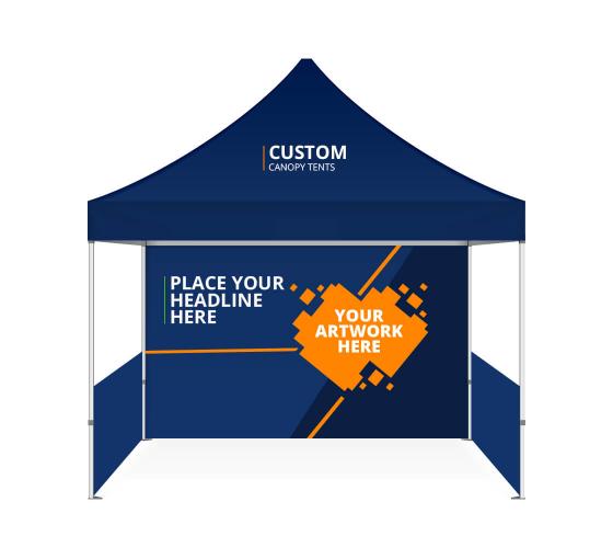
Color is one of the most valuable tools in a designer’s arsenal. Each different color has a unique effect on the consumer’s perception of your brand. The study Color For Impact found that ads in color are read up to 42% more than the same ads in black and white. Consider this when creating your marketing materials and designing your banners and signs. Customization is easy to achieve and intuitive when you utilize existing templates that have researched color psychology.
Color Me Brand
In choosing color(s) you need to consider all your options and pick a color scheme that fits with the meaning and products of your brand. This synergy must register with your consumers. Different colors evoke different responses and can be utilized for specific marketing campaigns.
Additionally, some colors like red and orange work better for impulse buys and sale signs, because those colors encourage response from consumers.
Font Choices
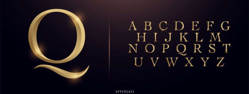
Just as color is important in your designs so too is typography(font) for overall brand identity aesthetic. You probably didn’t realize it; to the untrained eye this will come as a revelation. Different brands use different typography or fonts in their marketing for very specific reasons.
To find a font that works best with their brand, beta test it either using a company that can run consumer testing for you or, if that is not in your budget, use the best available resource: friends, family, and acquaintances. Apple uses a unique font called Myriad to give their marketing materials the same premium look and feel across each channel.
Learn From The Best
Picasso famously said “good artists copy, great artists steal.” The meaning of this quote is up to the reader to debate, but he ultimately means great artists take inspiration from everywhere and adapt it to fit their style.
Taking inspiration from your favorite brands isn’t a bad thing. After all, their logo, font and color schemes work for a reason. Finding that reason is the real challenge and may require some of your own creative explorations.
Designing Greatness
Great design rarely happens overnight. Rather it comes from exploring which designs work best for you. It’s a time consuming process. Hiring a designer can be advantageous from both a creative and time management perspective. Learn more about the design in your marketing by doing a deep dive into the power of design.
Design Explorations

A logo is one of pillars of design. The difference between storied brands is they constantly update their logo when change is in order. Even small changes can often lead to a better representative of a brand and open new avenues for their business.
For the best results, adopt consistent visual and tonal guidelines across all your marketing materials. Here’s where you may need to hire a designer that will make your difficult design decisions easier with their expertise.
Resources
– Color Psychology of Consumer Decision Making NeuroRelay
– How Colors Affect Conversions KissMetrics
– How to Explain Why Typography Matters Commarts.com– Why All Sale Signs Are Red: The Science of Color in Retail Shopify
-Why Colors Matters Colorcom
-The Psychology of Color: the Color Green Impact


 Posted in

