Brochures are powerful marketing tools designed to inform, engage and persuade potential clients. Whether you’re promoting a product, event or service, a well-crafted brochure can make a lasting impression and drive customer action. However, understanding how to create a professional brochure that stands out requires more than just slapping text and images together. It involves careful planning creative thinking, and a deep understanding of your target audience.
In this guide, we’ll walk through the steps to design custom brochures that effectively communicate your message while delivering a visually engaging experience. From setting clear objectives to choosing the right design elements, you’ll learn how to create an ultimate brochure that captivates and converts.
1. Define the Purpose and Audience
Before diving into the design process, it’s essential to define the brochure’s purpose. Is the goal to inform, promote or sell? Who is the intended audience? Answering these questions will shape the overall direction of your brochure and determine the tone, messaging and design style.
For instance, a brochure for a luxury product will likely have a different design than one for a community event. Understanding your audience’s needs and preferences will help you craft messaging that resonates and visuals that appeal to them.
Key Considerations:
- What action do you want readers to take after viewing your brochure?
- Are you targeting a specific demographic (age, income, profession)?
- How does this brochure fit into your overall marketing strategy?
2. Choose the Brochure Format
Brochures come in various formats, and choosing the right one depends on how much information you want to convey and the way you want to present it. The most common tips for creating an effective brochure format includes:
Bi-fold: A single sheet folded in half, creating four panels. It’s compact and ideal for concise messaging.
Tri-fold: The sheet is folded into three sections, offering more space for detailed information. It’s a popular choice for corporate or product brochures.
Z-fold: This fold creates a zigzag structure, providing additional panels for creative layouts and larger images.
Gatefold: The brochure opens like a gate, with two side panels revealing the main content inside. It’s perfect for high-impact visuals and storytelling.
Note: When selecting a format, think about how the reader will interact with the brochure and how you can best structure the content for easy reading and navigation.
3. Craft Clear and Compelling Messaging
The heart of any brochure is its content. To create an effective brochure, focus on delivering clear, concise and compelling messages that grabs attention and keeps the reader engaged.
Headline: Start with a strong, attention-grabbing headline. It should quickly convey the brochure’s main purpose and pique curiosity. A headline like “Discover the Future of Smart Living” is far more engaging than a simple “Product Brochure.”
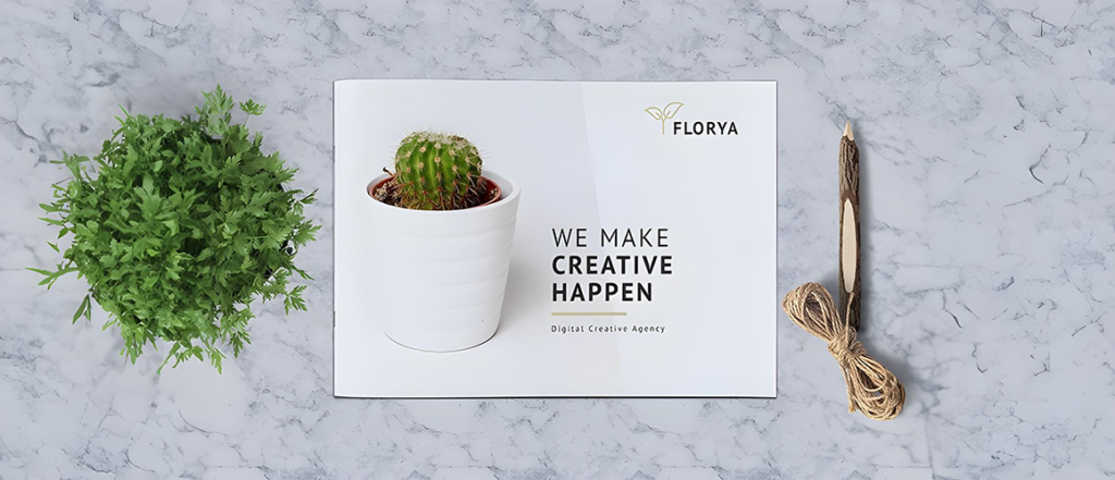
Body Copy: Keep the body text simple and direct. Use short paragraphs, bullet points and headers to break up the text for easy reading. Focus on the key benefits your audience cares about and avoid unnecessary jargon or overly technical language.
Call to Action (CTA): Every brochure needs a clear CTA. Whether it’s “Call us today,” “Visit our website,” or “Book your appointment,” make sure the reader knows exactly what action to take next.
Tips for Crafting Clear Messaging:
- Use a conversational tone to build a connection with the reader.
- Highlight the most important information first (e.g., promotions, key features).
- Keep sentences and paragraphs short for easy readability.
4. Incorporate Engaging Visuals

Visuals play a crucial role in brochure design. A compelling image or graphic can communicate a message far more effectively than words alone. To create a professional brochure, focus on choosing high-quality visuals that support your content and enhance the overall design.
Images: Use crisp, high-resolution images that are relevant to your message. If you’re promoting a product, feature product images in action to help the reader visualize using it. For a service, lifestyle images that reflect the benefits of your offering work well.
Graphics and Icons: Icons and illustrations can help break up large chunks of text and make your brochure more visually appealing. Use icons to highlight key points or steps in a process, making the content easier to scan and understand.
Color Scheme: The colors you choose should align with your brand and evoke the right emotions. Warm colors like red and orange create a sense of urgency or excitement, while cool colors like blue and green evoke calmness and trust.
Typography: Stick to no more than two or three fonts for a clean, cohesive look. Use bold fonts for headlines and subheadings and a more legible font for the body text. Avoid overly decorative fonts that might be difficult to read.
5. Organize Content with a Structured Layout
A cluttered brochure is a quick way to lose a reader’s interest. Creating an effective brochure requires a structured layout that guides the reader through the content in a logical and visually appealing way, which is why a brochure making guide is highly recommended!
Hierarchy of Information: Establish a visual hierarchy by prioritizing key messages. Use larger fonts or bold colors for headlines and calls to action. Break the content into sections, using headers and sub-headers to separate topics.
Balance and Alignment: Maintain a balance between text and visuals. White space is essential for creating breathing room and preventing the design from feeling overwhelming. Ensure that elements are aligned for a polished, professional look.
Flow: Think about how a reader’s eye will naturally move through the brochure. Place important information (like the headline and CTA) at the top or center of panels where they’re most likely to catch attention. Make sure there’s a logical flow from one section to the next.
6. Add Finishing Touches: Paper Stock and Print Quality
Your brochure’s physical quality is just as important as its design. The right paper stock and printing techniques can elevate your brochure from ordinary to extraordinary.
Paper Stock: Thicker paper, such as cardstock, feels more substantial and professional, while glossy paper can make colors and images pop. Matte finishes, on the other hand, offer a more subtle, elegant look.
Special Finishes: Consider adding special printing finishes like embossing, foil stamping, or spot UV for added texture and visual appeal. These details can make your brochure stand out and leave a lasting impression.
Tips for Print Quality:
- Ensure images are at least 300 DPI for crisp, clear printing.
- Use bleed settings to avoid unwanted white edges.
- Proofread the entire brochure multiple times before sending it to print.
7. Evaluate and Test Your Brochure
Before distributing your brochure, take the time to evaluate its effectiveness. Share it with colleagues, friends, or focus groups to get feedback. Are they drawn to the design? Do they understand the message? Are the calls to action clear?
Testing your brochure with your target audience will help you identify any areas for improvement before making a large print run.
Creative Brochure Design Ideas to Inspire You
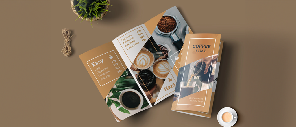
Need some inspiration for your next brochure project? Here are a few creative brochure design ideas:
Minimalist Design: Use a clean, uncluttered layout with lots of white space and simple typography for a modern look.
Interactive Brochures: Incorporate QR codes or foldable sections that reveal hidden content, creating a more interactive experience.
Bold Typography: Make a statement with oversized fonts and bold color contrasts for an eye-catching brochure.
Storytelling Layout: Use visuals and text to create a narrative that takes the reader on a journey, engaging them from start to finish.
Conclusion
Creating an ultimate brochure doesn’t have to be overwhelming. By following these steps to design a brochure, you’ll be able to craft a piece that effectively communicates your message, engages your audience, and drives results. Whether promoting a business, product, or event, remember your brochure should reflect your brand and the value you offer.
With thoughtful design, clear messaging, and the right format, your brochure can become a powerful marketing tool that leaves a lasting impression.
Written By BannerBuzz Editorial Team


 Posted in


